1. Select a dataset
We're gonna use The dataset for this tutorial tracks global daily streams on the music streaming service Spotify.
We focus on five popular songs from 2017 and 2018:
- "Shape of You", by Ed Sheeran (link)
- "Despacito", by Luis Fonzi (link)
- "Something Just Like This", by The Chainsmokers and Coldplay (link)
- "HUMBLE.", by Kendrick Lamar (link)
- "Unforgettable", by French Montana (link)
2. Load tha data
# Path of the file to read
spotify_filepath = "../input/spotify.csv"

# Read the file into a variable spotify_data
spotify_data = pd.read_csv(spotify_filepath, index_col="Date", parse_dates=True)
3. Examine the data
NaN == Not a Number
+) .head() 또는 .tail()을 사용하기

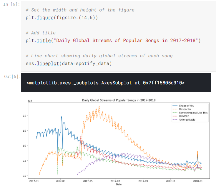
4. Plot the data
- sns.lineplot()
- sns는 Seaborn package의 축약어
- sns.barplot(), sns.heatmap() 등을 차차 배울 예정
- data=(데이터셋의 이름): 차트를 그리는데 쓰이는 데이터를 선택
- 아래의 예제 코드를 계속해서 반복해서 씁니다. 오로지 dataset의 이름만 바뀐다는 것을 명심하세요.

때때로 차트에 이름을 추가(plt.title())하거나 사이즈를 조정(plt.figure(figsize=(폭,높이 inche))한다면
코드가 조금 달라질 순 있지만, 그건 선택적이니 알아서.
title 사용 시 꼭 "" 문자열을 적어라!
5. Plot a subset of the data
지금까지 dataset의 모든 column에 대해서 그래프를 하나씩 그려보는 방법을 배웠습니다.
이제 모든 column이 아닌 subset columns, 알고 싶은 것만 골라서 그려봅시다.
앞서 모든 column의 이름을 출력해봅니다. 그럼 정확하게 내가 알고 싶은 column의 이름이 보이겠죠?

첫 두 column에 대해서만 그리게 된다면.
sns.lineplot()을 두 번 씁니다.
data=데이터이름['column이름'] 으로 접근하고요.
# Set the width and height of the figure
plt.figure(figsize=(14,6))

# Add title
plt.title("Daily Global Streams of Popular Songs in 2017-2018")

# Line chart showing daily global streams of 'Shape of You'
sns.lineplot(data=spotify_data['Shape of You'], label="Shape of You")

# Line chart showing daily global streams of 'Despacito'
sns.lineplot(data=spotify_data['Despacito'], label="Despacito")

# Add label for horizontal axis
plt.xlabel("Date")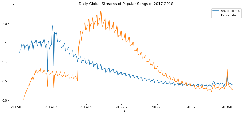
보통 column 하나에 대해서만 그래프 한 줄을 그립니다!
그리고 label은 column 이름으로 지정하고요!
plt.xlabel("Date") x축의 정보를 날짜 형식으로 나타나게 변환해줍니다.
Exersice
Scenario
당신이 LA의 박물관 매니저로 고용되었다고 해봅시다. 첫번째 미션은 아래의 5개의 박물관에 초점을 두는 것입니다.

각 박물관의 월 방문객 수는 LA에서 공식으로 제공하는 data.lacity.org/에서 가져올 수 있습니다.
Setup
import pandas as pd
pd.plotting.register_matplotlib_converters()
import matplotlib.pyplot as plt
%matplotlib inline
import seaborn as sns


import os
if not os.path.exists("../input/museum_visitors.csv"):
    os.symlink("../input/data-for-datavis/museum_visitors.csv", "../input/museum_visitors.csv")
from learntools.core import binder
binder.bind(globals())
from learntools.data_viz_to_coder.ex2 import *


print("Setup Complete")
1. Load the data -> Review the data
첫번째 미션은 museum_data 속의 LA 박물관 방문객 수를 읽어오는 것입니다.
- index_col="Date" : "Date" column의 값을 row의 label로 쓴다는 의미. (Excel에서 A1 cell의 자리를 의미)
- parse_dates=True : "Date" 정보를 문자열이 아닌 '날짜'라는 데이터 타입으로 변환
# Path of the file to read
museum_filepath = "../input/museum_visitors.csv"

# Fill in the line below to read the file into a variable museum_data
museum_data = pd.read_csv(museum_filepath, index_col="Date", parse_dates=True)


# Print the last five rows of the data
museum_data.tail()

# Fill in the line below: How many visitors did the Chinese American Museum
# receive in July 2018?
ca_museum_jul18 = 2620

# Fill in the line below: In October 2018, how many more visitors did Avila
# Adobe receive than the Firehouse Museum?
avila_oct18 = 19280-4622
#oct이란 말에 8월이라 생각했다.ㅋ- df.tail() : print the last five rows of the data

마지막 row ( 2018-11-01)에서 2018년 11월의 각 박물관 방문객 수를 볼 수 있죠.
그 전 줄에서는 2018년 10(October)월의 각 박물관 방문객 수. 반복됩니다.
2. Convince the museum board
Firehouse Museum은 2014년에 커다란 이벤트를 열었기에 그 년도에는 방문객 수가 엄청났다고 말합니다. 비슷한 이벤트를 또 열고 싶으니 예산을 더 달라고 하는군요. 다른 박물관은 그런 이벤트는 딱히 중요하다고 생각하지 않습니다. 그러나 예산은 매일 몇 명의 방문객이 최근에 방문했는지 그 수에 따라서 정직하게 분배해야겠지요.
각 박물관마다 붐비는 시기를 비교해둔 museum board를 보시면, 시간이 지날수록 각 박물관의 방문객 수가 어떻게 증가하는지 line chart를 그릴 수 있습니다. 각 박물관에 대해서 코딩을 하여 4줄을 작성해봅시다.
# Line chart showing the number of visitors to each museum over time
sns.lineplot(data=museum_data['Avila Adobe'], label='Avila Adobe')
sns.lineplot(data=museum_data['Firehouse Museum'], label='Firehouse Museum')
sns.lineplot(data=museum_data['Chinese American Museum'], label='Chinese American Museum')
sns.lineplot(data=museum_data['America Tropical Interpretive Center'], label='America Tropical Interpretive Center')

plt.show()
3. Assess seasonality
Avlida Adobe 박물관의 직원들과 미팅이 잡혀있다네요.
그 미팅 전에, 당신은 각 박물관의 방문객 수는 계절마다 크게 차이난다는 소문을 전해들었습니다.
방문객 수가 적은 계절에는 인원 충분으로 직원들이 행복하고, 방문객 수가 많은 계절에는 인원부족으로 직원들의 스트레스 만땅이라고요...ㅎ
그래서 방문객 수가 높고 낮은 계절을 예측하여, 어느 계절에 추가적으로 고용하면 좋을지 도와줘봅시다.

Avila Adobe 박물관의 방문객 수 변화 그래프만 뽑아보면
연초와 연말에 급감하고 여름 계절에 급증하는 걸 읽어볼 수 있네요.
그러니 여름에 더 많은 인원을 고용해야겠네요.
'Machine Learning > [Kaggle Course] Data Visualization' 카테고리의 다른 글
| [Kaggle Course] Choosing Plot Types and Custom Styles (0) | 2020.11.16 |
|---|---|
| [Kaggle Course] Distributions (histogram + density plots[KDE]) (0) | 2020.11.16 |
| [Kaggle Course] Scatter Plots (0) | 2020.11.15 |
| [Kaggle Course] Bar Charts, Heatmaps (0) | 2020.11.13 |
| [Kaggle Course] Seaborn (0) | 2020.11.02 |